
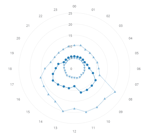
The widget displays one or more user-selected signals in a radar chart. By moving your cursor over the value bullets, you will see balloons containing the average values and the number of values of the average.
The radar is divided into segments depending on the selected data frequency (for example, Avg in 7 days displays a segment per day of the week). The value of a segment represents the average of the averages in the selected period (for example, with Avg in 7 days option and a 3 months long period, the value of the mon segment represents the averages of all the Mondays averages in the 3 months period).
By clicking on the 3-dots icon, you access the widget menu, then, by clicking the gear, the editing modal.
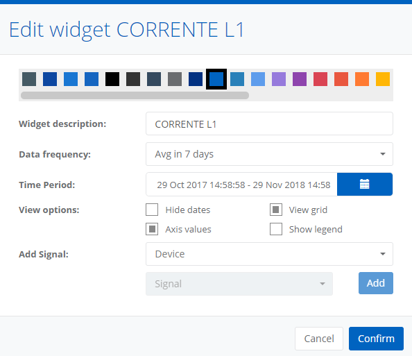
In addition to the color of the widget, it is possible to set the view options:
- Hide dates allows to hide the references to the selected data frequency;
- View grid allows to view the grid that delimits the radar segments (default);
- Axis values allows to view radar values axis (default);
- Show legend allows to specify whether tho show the legend next to the chart.
Through the edit window it is also possible to edit the data frequency (Avg in 60 minutes, Avg in 24 hours, Avg in 7 days, Avg in 31 days, Avg in 52 weeks, Avg in 12 months) and the reference period.
It is possible to add signals in the chart with the proper command.
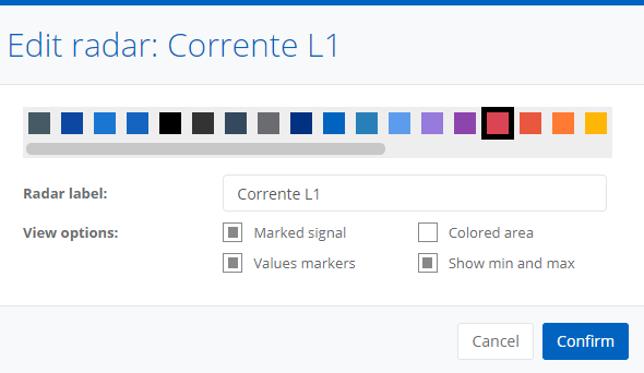
By clicking one of the values bullets of a chart in the radar, in addition to changing its color and label, it is possible to specify whether to:
- show marked signal (default);
- show colored area inside the chart;
- show values bullets (default);
- show charts for the maximum and de minimum averages in the selected period.
0 Comments