
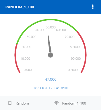
The widget shows the last received value of a signal on a tachometer-like chart, whose bands are set by the user in the widget creation procedure.
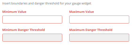
Minimum and maximum values are required, once they are set is also possible to specify the thresholds, that represent the red bands of the gauge:
- Minimum band, delimited by the minimum value and the minimum threshold;
- Maximum band, delimited by the maximum threshold and the maximum value;
- Middle band, delimited by the minimum threshold and the maximum threshod.
Once all the values have been set and the source signal has been chosen, the widget is added to the dashboard.
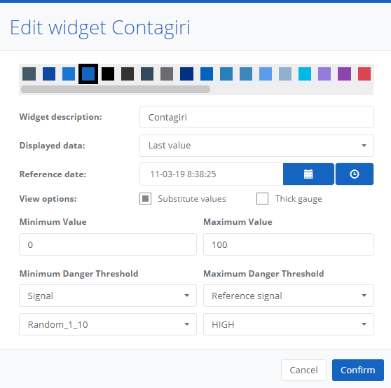
By accessing the edit modal it is possible to set the displayed data and reference date (for example, Hourly Average shows the last available hourly average).
The Custom avg option allows to select the reference date range and the type of source data (All values, hourly averages, daily averages, weekly averages, monthly averages), so that the value represents the average of the signal in the selected period calculated with the selected type of data.
If the displayed data is not set to Last value, it is possible to choose whether to show the maximum, the minimum and the deviation from the average of the selected period.
It is also possible to show value substitution if it is set in signal options (substitution colors are applied even if substituted value option is not set).
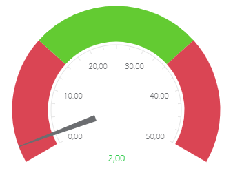
In the widget view options, an alternative visualization is available for the gauge, it uses a thicker style.
In the edit modal it is also possible to update thresholds. Unlike in the widget creation, it is possible to set variable thresholds, by selecting signals as thresholds. It is possible to choose among the displayed signal reference signals and the other signals of the same device.
0 Comments